Topic 7
Introduction to GUI Applications with Compose Multiplatform
Compose Multiplatform
Compose Multiplatform is a multi-platform framework to allow you to develop GUI applications across a range of platforms. Originally a framework for Android apps specifically (Jetpack Compose), it now supports a range of different platforms including common desktop platforms (Windows, Linux, Mac) as well as iOS. This means that with Compose Multiplatform, you can develop apps for multiple platforms using the same codebase - without having to develop seperate versions for Android, iOS, and desktop.
We are using Compose Multiplatform in this module for these reasons:
- It is cross-platform, as stated above;
- It uses a declarative style, also seen in many other contemporary UI frameworks, such as React, so you can use the skills you learn in other environments;
- Android uses Compose, so it will prepare you well for Mobile Application Development if you are doing that module.
Declarative UIs
Compose Multiplatform adopts a declarative approach to UI development. What does that mean?
- With a declarative approach, we declare the layout by specifying the UI elements within the layout in the order in which they appear.
- If we need to store data (such as a name the user entered, or the number of times a user clicks a button) we store it in state. State is data which represents the current state of the UI, and we can use state to decide what is displayed to the user in the UI.
- We don't need to write code logic to construct the UI elements, or to manually modify the UI elements if the underlying data changes.
So, code for a declarative UI might look something like this (note that this is not real Compose code, but a simplified version to illustrate the concepts):
- Note how we specify our app layout by including all the elements in the order in which they appear.
- Note also the state variable (called
state) which is set to "Not Clicked" by default. When the user clicks on the button, the state variable is set to the value "Clicked" via anonClicklambda. - Note that the second
Textdisplays the value of the state variable, so it will display either "Not Clicked" or "Clicked". - Importantly in declarative layouts, UI elements which use state are re-rendered (re-drawn) when the state changes. So when the variable
stateis updated, the secondTextis automatically redrawn. Unlike non-declarative layouts, we do not have to implement logic withifstatements to re-render the layout.
See Thinking In Compose in the Android documentation.
Kotlin Multiplatform and Compose Multiplatform
What is the difference between Kotlin Multiplatform and Compose Multiplatform?
- Kotlin Multiplatform allows you to develop Kotlin projects that work across a range of platforms including Windows, Linux, Mac OS X, Android, and iOS. These projects do not necessarily need a Compose UI.
- Compose Multiplatform is specifically a version of the Compose UI which supports platforms other than Android, such as desktop, iOS and even web.
Compose Multiplatform apps are thus a subset of Kotlin Multiplatform apps, and if you create a Kotlin Multiplatform project, you can optionally add Compose code to make it also a Compose Multiplatform project.
More on Kotlin Multiplatform on the Kotlin website.
Getting started with Kotlin Multiplatform and Compose Multiplatform
There are two main ways of starting up a Kotlin Multiplatform (including Compose Multiplatform) project:
- Use the Kotlin Multiplatform Wizard on IntelliJ IDEA (recommended on the university computers).
- Create a Compose Multiplatform project on IntelliJ IDEA using the Kotlin Multiplatform Plugin (recommended on your own computer);
We will look at these one by one. More information on setting up a Compose Multiplatform project can be found on the JetBrains GitHub repositories.
Using the Kotlin Multiplatform Wizard
On the university computers, you need to use the Kotlin Multiplatform Wizard, an online, web-based utility for generating and downloading a Kotlin Multiplatform project. This is because the plugin is not available for the (slightly older) version of IDEA that is installed; only IDEA 2025.2.2 or upwards is supported.
The Kotlin Multiplatform Wizard auto-generates a project with the correct settings for building successfully. To use the Wizard, visit kmp.jetbrains.com. You need to choose your target platforms: for our purposes we only need Desktop so select Desktop and unselect Android and iOS.
Unzip the wizard-generated project and copy the project directory to your IdeaProjects directory.
Then open the project. Load IDEA, select "Open" and open the project.
A full information page about building and running wizard-generated Kotlin Multiplatform projects is available from Jetbrains.
The project structure will look like this:
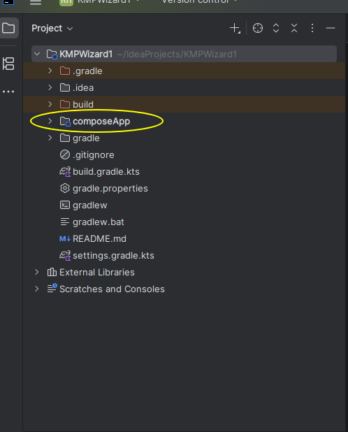 .
.
The actual code is inside composeApp.
If you open composeApp you will see the full structure:
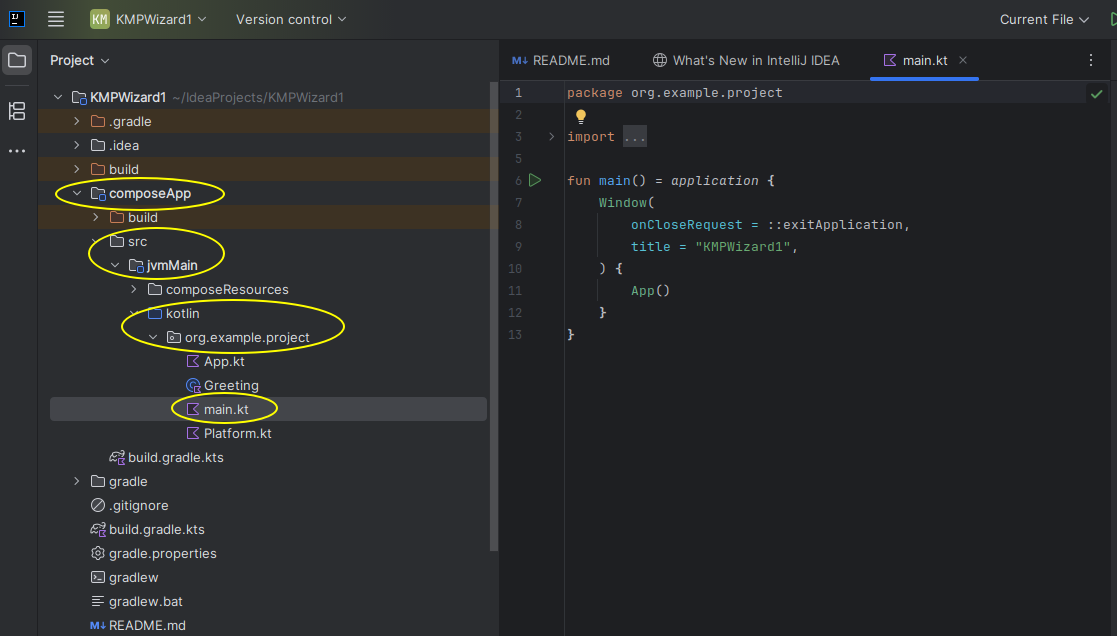 .
.
You can find the Kotlin code inside src-jvmMain-kotlin and then inside a package directory (org.example.project here). In larger scale projects, code is typically placed inside a uniquely-named package (typically your company's web URL in reverse) which reduces the possibility of clashes with class names between your own classes and third-party library classes; if a class is inside another package, you have to explicitly import it.
You can then compile and run the project. Normally, as always, the green "run" button can be used but unfortunately on the lab computers this fails with an obscure error. Instead, you will need to use the command prompt to build the project. Note that Compose Multiplatform projects use the build tool Gradle. Gradle is a build tool used to compile Java- and Kotlin-based projects from source and create a runnable program. Normally, it's used via the IDE but occasionally it might be necessary to run it directly.
To do this, select the "console" tool on the bottom left (highlighted below) to access the console and enter:
to build the project, i.e. compile your code and produce an executable application.
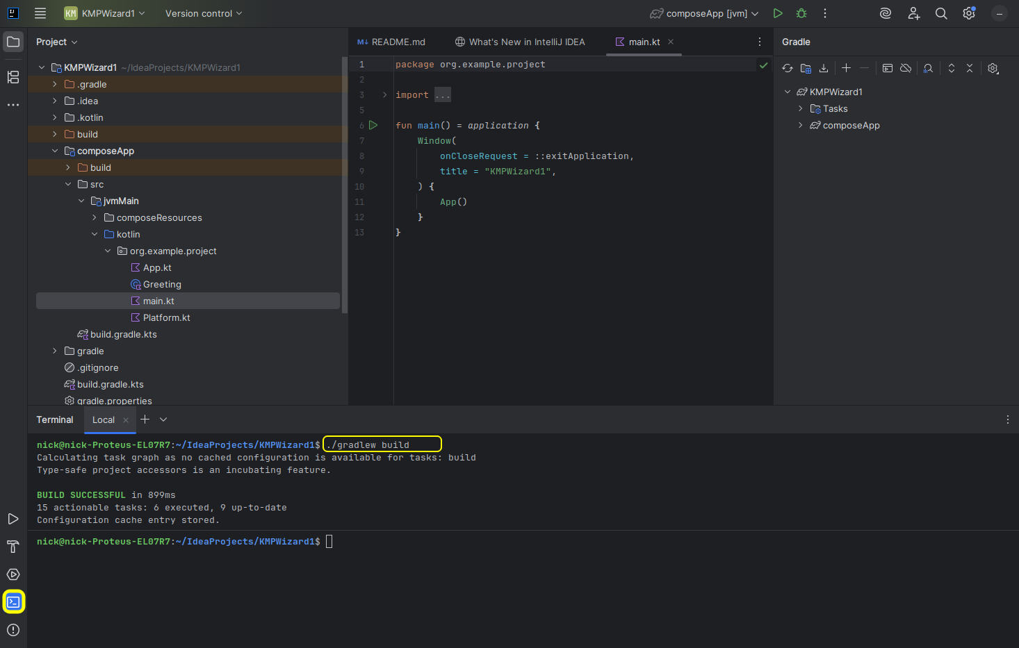
Once it's compiled you can then run the project with:
as shown below:
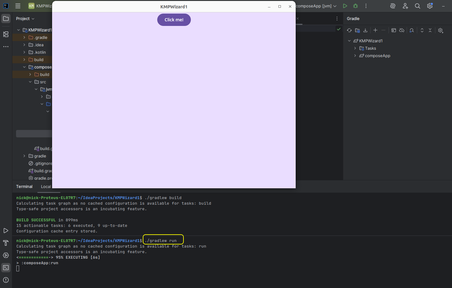
This will run a Compose project using the sample auto-generated code.
Using the Kotlin Multiplatform Plugin
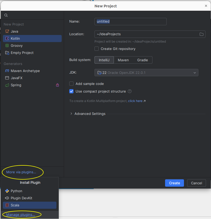
If you are using the latest versions of IDEA (version 2025.2.2 upwards) you can install the Kotlin Multiplatform Plugin to IDEA, which will integrate the functionality of the Wizard directly into IDEA rather than running it as a separate web application. When you create a project you will see a "More via plugins..." link in the bottom-left, which when clicked, will open a window containing a "Manage plugins..." link:
When you click on "Manage plugins..." you will see a screen allowing you to search for and install plugins:
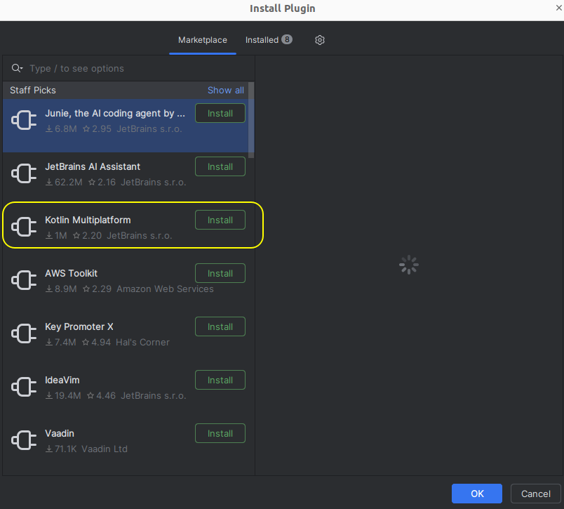
You should see Kotlin Multiplatform, if not, search for it. Install it and then restart IDEA.
When you create a new project after restarting, it will offer you the option of a Kotlin Multiplatform project.
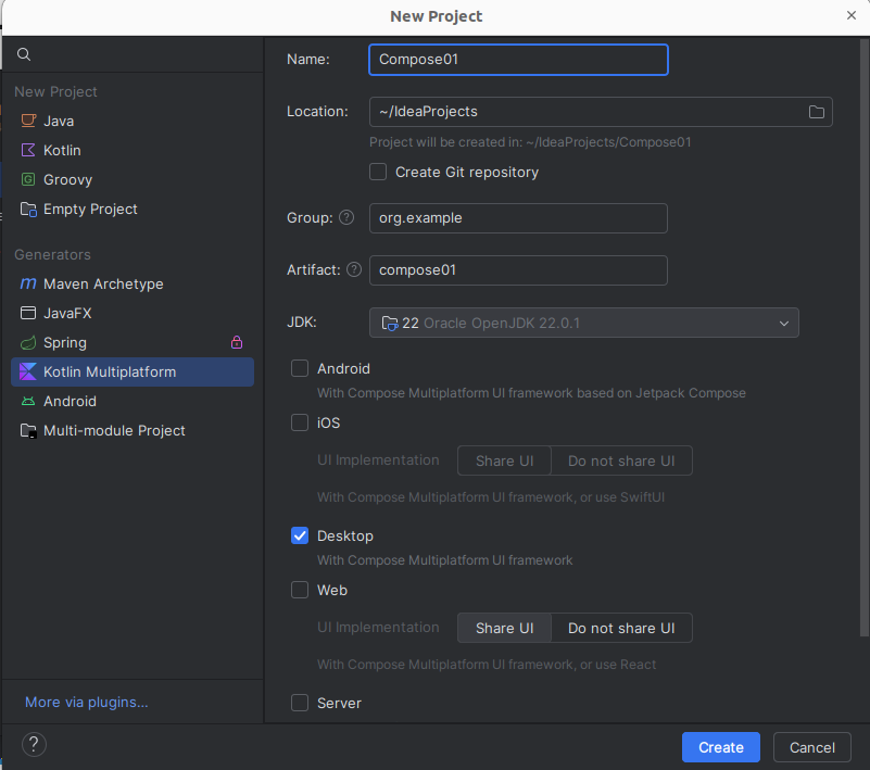
As for the web-based Wizard, you should select the Desktop option and unselect the Android and iOS options.
When your project is created, it will have the same structure as the project created by the web-based Wizard, above.
Developing with Compose Multiplatform
We will now start looking at the structure of a Compose Multiplatform application. You'll notice that a lot of generated code has been produced, but we can remove most of that to demonstrate a Hello World Compose application. For example you can remove the Greeting and Platform.kt files and simplify the App.kt.
We will start with the main.kt containing the main() function:
What's going on here?
You will notice that, as always, there is a
main()function which is the starting point of our application. Note, however, the different syntax:rather than
What's this doing?
application()is part of the Compose API. Compose Multiplatform, like other UI libraries, needs to work in an asynchronous (multitasking) manner, so that the user can continue to interact with the UI while the application is performing some processing. However, the console is a purely synchronous (non-multitasking) environment. Theapplication()function essentially acts as a "bridge" between the synchronous console and asynchronous Compose environment. See here and here. We will look at this topic in more detail in Mobile Application Development when we examine coroutines.- We then create a
Windowobject. As you can probably guess, this represents a UI window. Note how we give theWindowanonCloseRequestparameter (Kotlin has named parameters, like Python, i.e. we do not need to pass in values for all parameters or pass them in order, we can refer to them by name). This parameter is set equal to the in-built functionexitApplicationwhich closes the application down. So, when the user closes the window, the application will exit. - Note how we then specify a lambda function as an argument to
Windowand inside this lambda we initialise the UI of our window by callingApp().App()is a composable function (discussed below) representing the UI of our application, and can be found withinApp.kt.
Composable functions
In Compose Multiplatform, we define each UI component as a composable function. A composable function represents a UI component which can be drawn to the screen (composed). Composable functions typically represent reusable groups of UI elements which work together, e.g. a login composable function could contain username and password fields and a button which logs the user in.
The main composable function of a Compose Multiplatform application is normally named App() and in a desktop app is included within the Window in our main(), as we saw above.
Here is a simple App(), which could be used for a Hello World app. Replace the pre-generated code inside App.kt with this:
Note how we create our composable function App() labelled with the annotation @Composable. This turns App() into a composable. Annotations are meta-language instructions which are converted by a pre-processor into more complex Kotlin or Java code; in the case of @Composable, a Compose pre-processor converts the annotation into more complex Kotlin code, but you never see this code.
The App function contains a Text composable (Text is an inbuilt composable, part of the Compose library) which displays a Hello World message.
Note that the content is wrapped in a MaterialTheme. This applies a theme (look and feel) to your app using the principles of Material Design. We will look at themes and Material Design in more detail in Mobile Application Development.
Writing custom composables
So far we have just created a default App() composable. However we normally create multiple custom composables, which can be reused in multiple applications. These can then be included within the App() composable as child composables of App to develop a more complex UI. For example here is a custom composable function called HelloWorld():
Note how we call HelloWorld() from the App composable, which will result in HelloWorld becoming a child composable of App.
A more complex composable function
Note that in all these examples, where an import is marked with
you need to add it to the list of imports already present.
This example creates a composable function with two UI elements: two Text elements arranged vertically. The vertical layout is defined with Column which arranges all the elements within it in a vertical column. There is also Row which arranges all elements within it horizontally. If we don't specify a layout (row, column or others), composables will appear on top of each other.
This example also illustrates how composables always take a lambda as their final argument. In this lambda, we specify the child composables of that composable. So for example, here, Column is a composable representing a column, and we specify a lambda function containing its child composables (two Texts). We use this pattern of coding no matter what composable we use.
Controlling the appearance of UI elements
We can control the appearance of a UI element by setting various parameters on the element. For example we can control colour, font style (normal or italic), font weight (normal or bold) and font family. Here is the previous example with the appearance of the Text elements styled:
Hopefully much of this is fairly clear but a few points:
Note how each argument to Text is labelled with an identifier, e.g. fontStyle=.... As stated above when discussing the Window, this is an interesting feature of Kotlin which is also seen in Python; we do not have to pass in the arguments to a function in order if we label them. So Text() for example has color and fontStyle parameters and these can be specified in any order as long as they are labelled.
Specifying font size
We can also specify the size of our font, e.g:
What does sp mean? It's a unit of measurement, the scalable pixel - like a pixel but can adjust its size to different screen resolutions, allowing a layout to be stretch and shrink to fit the screen no matter what the resolution. We will look at scalable pixels in more detail in the Mobile Application Development module.
Extension functions
You'll notice the syntax 24.sp for the font size. What does this syntax mean? The sp is an extension property of Int.
With Kotlin we can add one, or a small number, of functions (methods) and properties (attributes) to a class without using inheritance - these are called extension functions and properties. This can be very useful if we just want to add a small amount of functionality to a class, for example:
Note how we are adding a greet() function to String, so all Strings can have greet() called on them. The greet() functon takes a greeting as a parameter, which has a default value of "Hello". It then prints the greeting, followed by the string's actual value (i.e. this). So if greet() is called on the string "Fred", it will display "Hello Fred", while if it's called on the string "Fred" with an argument of "Goodbye", it will display "Goodbye Fred".
Note again how the parameter greeting takes on a default value of "Hello". This feature, also seen in Python, is common to all Kotlin functions, not just extension functions.
Passing in Parameters
We can pass parameters into our composables and use those parameters to control how they display, e.g this composable will display a given message a given number of times in a column by using a loop to include a Text the given number of times displayed in a given colour (black by default):
This could then be included in your App as follows:
Events and State
Many UI elements in Compose Multiplatform come with an accompanying event handler, which runs when the user interacts with it. Examples include Button (which comes with a click handler) and TextField (which comes with an onValueChange event handler to handle the text in the text field changing). Event handlers are typically specified as lambda functions. We will now start building a GreetingBox which allows the user to enter their name and displays "Hello" plus their name.
Note how the TextField takes two compulsory arguments, the default text to place inside the text field, and the onValueChange event handler which runs when the user enters text (a lambda function). Note that here we have used named parameters in the TextField, we do not need to do this (as the value and onValueChange event handler are the first two parameters) but have added them for clarity.
How can we actually display a greeting in the Text corresponding to the name that the user entered, though? Or, in general, how can we dynamically update a Compose UI? We use composable state to do this. In event handlers, we update state variables, and then we include that state in other UI elements. When a state variable updates, composables which use that state variable will automatically be redrawn. This is called recomposition. The leading Web UI library React, which some of you will meet next term, also uses this pattern.
So how do we setup state? We have to declare a state variable to represent the state. State variables are variables of type MutableState, for example MutableState<String> for a String state variable, though you don't normally need to declare the type as Kotlin infers it from your initialisation. For example:
The remember function creates a MutableState variable called nameState which is initialised within the provided lambda to a blank string "". The state will be remembered when the composable is recomposed (redrawn).
We can then insert the state variable within the UI where we like. To reference the actual value of the MutableState, we have to use its value property. For example:
- Note how we set the
valueof theTextFieldto the state variable so that the text field is always in sync with the current value of the state variable. - The
onValueChangeevent handler lambda for theTextFieldtakes the new text within the text field as its one and only parameter (it) so, in the event handler, we update the state variablenameStateto the current text in the text field. Then, in theTextelement, we include the state variable in our greeting, so the greeting will always sync with what the user entered in the text field.
Buttons
Buttons in Compose Multiplatform are quite easy to setup. Here is an example:
The Button function takes a number of parameters including an onClick event handler, for which we usually pass a lambda. Here, the lambda updates the state variable to "Clicked!" to indicate the user has clicked the button - this is shown in the Text at the end of the composable. After specifying the other parameters of Button we specify a lambda containing the text to display on the button as a Text component. In the same way as the Button and Text are child composables of the Column, this makes the Text a child composable of the button and will, as a result, make the text appear on the button.
Tab-based navigation on TextFields
If you try to create multiple TextFields in the same app, you will notice that you will be unable to navigate between them using Tab. This is because by default text fields are multi-line and multi-line text fields do not support tab-based navigation by default. You can, however, make the text field single line:
Furthermore, to enhance the user experience and show an outline round the currently-focused text field, you can use an OutlinedTextField:
You are strongly recommended to use single-line OutlinedTextFields in the second assessment, and any app which has multiple TextFields. Your application will be much more user-friendly if you do.
Exercises
- Try out "Hello World" and the "TwoTexts" and "TwoTextsStyled" examples, above.
- Write a complete working app including a composable to allow the user to enter their favourite programming language in a
TextField. The composable should display, in aTextbelow theTextField, Your favourite programming language is plus the programming language the user entered. Use 24sp font size. Ensure theTextupdates whenever the user changes the input in theTextField. - In the same app, write a composable to implement a counter. The composable should include a state variable to hold the counter's current value (initialise it to 0) plus a
Textcontaining the counter's value and a button which, when pressed, increases the counter by one. Display the counter's value in red with 32sp font size. In the same app, write a composable to convert feet to metres. One foot is 0.305 metres. The user should be able to enter a value in feet in a single-line
OutlinedTextField(it's not strictly needed here, but it's good to get into the habit of using user-friendly text fields early), and the result should be displayed in metres. Give yourTextFieldalabelparameter, this should be set equal to a lambda containing aTextelement with the label "Enter feet", i.e.:- Hint! Store the current feet as a
Stringstate variable and usetoDoubleOrNull()(see below) when you need to do the conversion. This will be easier than storing the feet as aDoublestate variable. - Hint 2: the
toDoubleOrNull()method ofStringwill return anullif the user enters something which is not a number (e.g. letters). You can make use of this together with the Elvis operator to set the value to 0 if the user enters a non-numeric value for the feet. You can also use it to display an error if the user enters a non-numeric value - have a go at this if you finish everything else.
- Hint! Store the current feet as a
Write a simple front-end mock-up of a login system. The application should have username and password single-line
OutlinedTextFields and a "Login" button. When the user enters the username "alex" and password "password", and clicks the "Login" button, the UI should recompose to show the message:plus a logout button. Similarly, the "Logout" button should cause the UI to recompose to show the login form again. Incorrect logins should result in an error message being displayed, but you should still show the username and password fields and "Login" button. Look at the documentation to find out how to hide the text when entering the password.