Topic 6
Navigation Part 2
This week will look at common UI elements for navigation including the TopAppBar, bottom navigation bar, floating action button and navigation drawer. We will also examine edge-to-edge mode.
Introduction
Last week we looked at navigation, and saw how we could represent multiple screens of an app with multiple composables and use NavController and NavHost to implement navigation. This week, we will look at how we can implement typical UIs designed for navigation, rather than just buttons.
Navigation components
Navigation components (all available as composables in Jetpack Compose) incude:
- The top app bar.This is the typical bar that appears on top of the screen with the app name together with a "hamburger menu" icon which, when clicked, shows a menu.
- The navigation drawer (
ModalNavigationDrawer) is a pull-out menu which appears, typically, on the left of the screen in response to the user clicking a "hamburger" icon. - The bottom navigation bar is an app-specific navigation bar which appears along the bottom of the screen, allowing the user to switch between different screens. It typically contains icons and accompanying text for each item. This is app-specific, and is separate to the system navigation bar which contains the Home and Back buttons.
- The floating action button is a button, typically near the bottom right of the screen, which allows the user to perform the most common action in a given application. For example in an email application the floating action button might allow the user to write an email.
Some of these are shown here: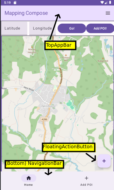
See here for Android documentation on app bars (top and bottom).
The Scaffold
The foundation of a Compose app with navigation components is the Scaffold.
What is a Scaffold? It's a top-level component which defines a framework for a layout with common application components such as a top app bar, a bottom navigation bar, or a floating action button.
You create a Scaffold and specify, as its parameters, the navigation components you want (e.g. top app bar, bottom navigation bar, and floating action button) and place the main content of your application (e.g. a map, a list, etc) within the Scaffold's associated lambda function:
Note that the Scaffold's lambda function takes one parameter, innerPadding. What is this? The navigation components take up screen space, so we want to ensure there is room for both them and the main content. The Scaffold calculates a padding to apply to the main content, to provide space for the navigation components and to ensure the main content is within, and not ovelapping, those components. The innerPadding is of type PaddingValues and can be applied to the main content via a modifier:
Using a Scaffold as a framework for navigation
Scaffold and the Top App Bar
Important: to use the top app bar using Material Design 3 you need to opt in to the experimental Material Design 3 API for the top app bar. (The top app bar has been around for a while, but is still considered experimental). Add this immediately before your onCreate():
The Top App Bar
To actually implement a top app bar you use the TopAppBar composable. You define its colours (colors) and actions as well as a title. The colours consist of the containerColor (the background) and the titleContentColor (the text). The actions are tasks that are launched by a user clicking an icon on the app bar (e.g. launching a menu). Here is an example:
Note how we define the two colours using the primaryContainer and primary colours from the material theme: this is recommended in the documentation. The actions represents the actions we wish to carry out when icons on the top app bar are clicked. It contains one or more icons along with an associated lambda function containing code associated with the action. Each action is defined with an IconButton: a composable which represents a clickable icon.
IconButton takes, as arguments:
- an
onClickevent handler. We will fill this in later when we look at the navigation drawer. - a lambda containing the actual
Icon. TheIconrepresents the actual icon which is displayed.Icon(andIconButton) is a composable. Material Design comes with a series of standard icons, which are recommended to be used where possible as they have been specifically designed to blend well into Material Design UIs. Here, we are using the standardMenuicon from Material Design, representing a "hamburger" menu.
Icons
There are a range of standard Material Design icons you can use within the androidx.compose.material.icons.Icons object; see the API documentation, which shows the icons that are available.
If you wish to use an icon which is not available in the Icons object, you can download it from the web; there is a much larger set available from fonts.google.com. They are available in Scalable Vector Graphics (SVG) format. SVG is a vector image format, in other words shapes are defined by a series of vectors (lines from one point to another) which means that they scale easily compared to pixel-based (raster) icons.
To use a custom icon, you should download it and then import it into your app's resources. To do this right-click the res folder and then select New-Vector Asset. The dialog below will appear: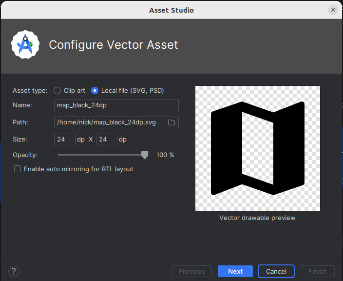
Then follow the steps and the imported vector image will appear in your drawable folder. You can then access it via R.drawable.imagename.
Here is an example of using a custom Icon:
Note how we supply a painter argument to load the image from the resources. By default the images will be black or white, however we can tint them to use a colour from our Material colour scheme, as is shown in the code above.
See the API documentation for more on icons.
Navigation with FloatingActionButton and NavigationBar
We will now return to the floating action button (FloatingActionButton composable) and bottom navigation bar (NavigationBar composable). The FloatingActionButton is a single button which appears typically at the bottom right of your screen and represents a primary action that a user would like to carry out (such as writing an email in an email application). The NavigationBar, otherwise known as the bottom navigation bar, takes the form of a series of labelled icons along the bottom of the screen allowing a user to switch between screens. The bottom navigation bar should not pop the back stack but instead navigate to a new instance of the given component.
We define each of these in our Scaffold with the floatingActionButton and bottomBar properties.
FloatingActionButton
Here is an example of a FloatingActionButton within an app's Scaffold:
Hopefully the floating action button code is easy to understand: it has an onClick argument in which we specify an event handler, and a content argument in which we specify the icon. (Icons.Filled.Add is the standard Material Design icon to use when adding something, e.g. a student in this case).
Bottom navigation bar
Here is an example of a bottom navigation bar (NavigationBar):
Again it shouldn't be too hard to understand. We specify a NavigationBar composable with two NavigationBarItems, one for each navigation destination. One is for the home screen and the other is for the "add student" screen. Each NavigationBarItem has:
- an
icon; - a
label(the text on the navigation item); - an
onClickevent handler; - a
selectedboolean representing whether this option is highlighted as selected. Currently we just set this tofalse; in a future session we will return to highlighting the currently selected item.
Buttons with Icons and Text
With Jetpack Compose we can easily set up buttons with both icons and text, e.g.
The key to understanding this is that the final argument to Button, a lambda, can contain more than one child composable, arranged in a row. Normally there is just a Text composable, however you can add an Icon as well, e.g:
The navigation drawer
See the Android documentation for more details.
Having looked at the TopAppBar and Scaffold, we can now look at the navigation drawer itself (ModalNavigationDrawer). An example is shown below, also showing the "hamburger" menu on the top bar which typically shows it when clicked.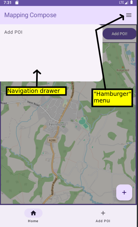
The navigation drawer consists of a drawer sheet (ModalDrawerSheet) containing the actual menu items, known as navigation drawer items (NavigationDrawerItems). We specify the drawer sheet through the drawerContent argument. The final argument of ModalNavigationDrawer is a lambda containing the content that the navigation drawer allows you to navigate between; this is likely to be your NavHost.
Hopefully this is fairly clear. We create a ModalNavigationDrawer and supply the drawer state (i.e. is the drawer showing (open) or hidden (closed)?; we will look at this below) and the drawer content. The drawer content consists of a ModalDrawerSheet. Inside the ModalDrawerSheet we define one or more NavigationDrawerItems (menu items). Each NavigationDrawerItem has a series of arguments:
selected- is the item selected by default?label- the text on the navigation drawer item;onClick- an event handler which runs when the user clicks the menu item.
Managing drawer state
What we have not seen yet is how to manage drawer state, in other words control whether it's currently showing (open) or hidden (closed). We do this by setting up a variable of type DrawerState using the inbuilt function rememberDrawerState().
This sets the drawer state up to be closed by default.
We then add code to the hamburger menu item in our TopAppBar to either open or close the navigation drawer depending on the drawer state. To return to the IconButton implementation in our top app bar, we can now fill in the onClick event handler:
Hopefully you can see that the logic is either opening or closing the drawer depending on whether it's currently closed or open. So each time the menu icon is clicked, the visibility of the drawer will flip. We will discuss the meaning of coroutineScope.launch below but you need to set it up within your composable hierarchy as follows:
The other code we need to implement is code to close the drawer when the user clicks an item in the navigation drawer. To return to the code to do this:
Note how we've added code to close the navigation drawer when the user selects an item.
You're probably wondering what the coroutineScope in the above code means. As it involves an animation, the process of opening and closing a navigation drawer is a time-consuming process which could potentially cause the UI to become unresponsive, thus it's done as a background process. In Kotlin this is done using coroutines (hence coroutineScope) - we will return to the concept of coroutines in the next topic.
Edge-to-edge mode
While we are discussing Scaffold, we will look at a topic which is not specific to navigation but does relate to your app layout and for which Scaffold can be useful, namely edge-to-edge mode.
You may have noticed that your entire UI covers the whole screen, including the status bar at the top of the screen and system navigation bar at the bottom, if you call enableEdgeToEdge() in your onCreate() or if you are running a device with Android 15 (API 35) or higher and a targetSdk of 35 or more in all cases.
This is known as edge-to-edge mode and is intended to allow more screen space for your app. Originally you would enable it with enableEdgeToEdge() but with the recent versions of Android mentioned above, it is now enabled by default and cannot be disabled.
This is shown below:
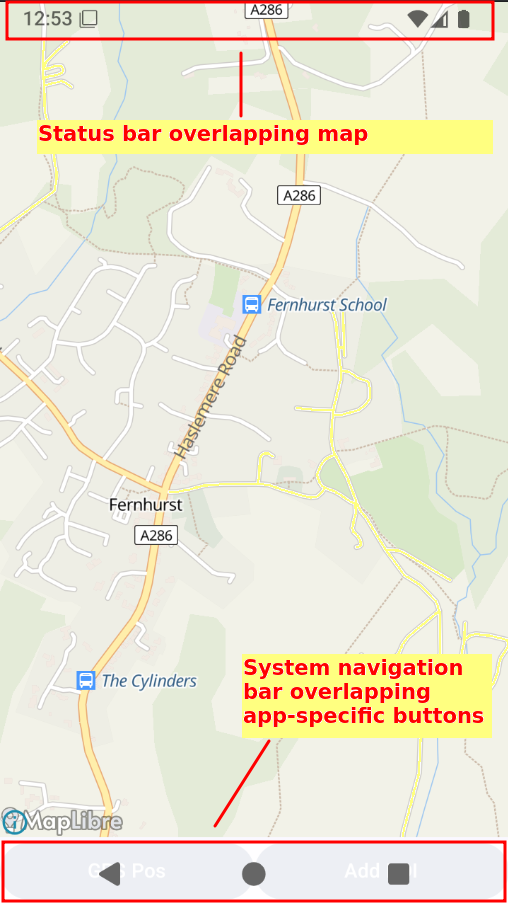
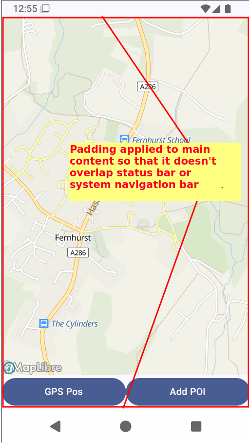
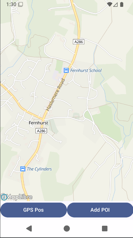
It can often be useful (in the example above, we can see more of the map as the status bar is not hiding it) but can also be problematic if you have your own UI elements close to the bottom of the screen, as they can be hidden by the system navigation bar.
The correct approach is therefore to design your UI to account for edge-to-edge mode. In many cases, using a Scaffold makes things easy for you.
The innerPadding provided to you by Scaffold will account for the status bar and system navigation bar, and ensure that your layout is not hidden by these system elements in cases where that is undesirable. So if you put your layout within the Scaffold and apply the innerPadding to the composables within the scaffold, they will appear as expected below the status bar and above the system navigation bar.
This is shown below.
It may be that you would like to add padding at the bottom of the screen to prevent the system navigation bar obscuring your content, but not at the top. In this example, having the map appear behind the system status bar is arguably a benefit, not a problem, as you see more of the map. One way of achieving this is to apply the bottom padding but not the top padding, but this can be problematic if you want to have a top app bar (below). Alternatively you can use WindowInsetsRulers - see the Android documentation for more details. You use a specific ruler for your layout with Modifier.fitInside(). For example, fitting inside the NavigationBars ruler will ensure your content does not overlap the system navigation bar, but does overlap the status bar (note that this does not require a Scaffold):
This will give the layout below:
To use rulers you need to add the foundation-layout library as an additional dependency, e.g. in your version catalog:
and:
Exercises
Imports needed
Please add these new imports:
- Return to question 2 from last week. Add a bottom navigation bar to the app, with items for the main screen (Home) and the settings screen. Note that you should be able to find Home and Settings icons inside the
Iconsobject; you will not need to download one. - Add a top app bar to the app, containing a "hamburger" menu icon which, when clicked, brings up a navigation drawer with "Map" and "Settings" entries. Ensure each entry navigates to the correct screen.
- Download a "map" icon from the Material Icons at fonts.google.com and use this on your bottom navigation bar instead of the Home icon.
- Change your regular navigation buttons from last week so they contain icons in addition to text. Use a
Settingsicon for the button to navigate to the settings, and anArrowBackicon for the button to return to the main screen. Note for the latter you will need to useIcons.AutoMirrored.Filled.ArrowBack. TheAutoMirroredis to account for the fact that some languages are right-to-left and the back arrow will point in the opposite direction in these languages. - Return to question 2 from last week (the shopping list application) and add a floating action button which will take the user to the "add new shopping list entry" screen.