Topic 2
Further Compose, Material Design
In this second session we will look at some further Compose topics that we have not looked at yet, including:
- Styling and Theming apps: Material Design and Themes
- Further Layout: Arrangement, Alignment, Box Layouts
- Images
Size units
First, some quick revision on a topic covered in OODD. We looked at font size in OODD using the dp and sp unit systems but didn't really cover what these meant in depth.
Before discussing sp, we will discuss the similar dp unit. What is the dp unit?
- A
dpis a density-independent pixel: a virtual pixel, corresponding to varying numbers of real pixels, which ensures that page elements occupy the same dimensions on the screen across different devices. Why do we need to do this? Different devices have different pixel density, in other words they contain varying numbers of pixels within a given distance on the screen, such as one centimetre or one inch (approximately 2.5cm). High-density screens have many pixels within a given distance, while low-density screens have less. Thus, density-independent pixels account for different pixel density of screens to ensure consistent appearance across different devices). If we used regular pixels for the width or height, UI elements would occupy different proportions of the screen on different devices. This is shown below:
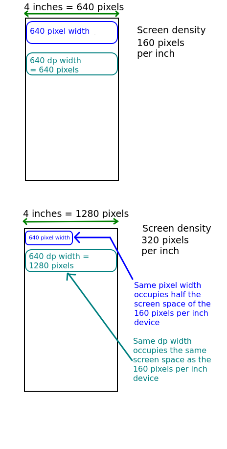
Density-independent pixels correspond exactly to pixels at a pixel density of 160 pixels per inch. If the density is greater than that, one density-independent pixel will occupy more than one real pixel, while if it is less, one dp will occupy less than one real pixel. See the Android documentation for more information on density-independent pixels, as well as this documentation on units of distance in Android in general.
What then are sp? These are scalable pixels, which are basically the same as density-independent pixels, but they adapt to the user's chosen font size as well as the pixel density and thus should be used for specifying font size.
Material Design
Material Design (see the website) is a published design philosophy which is adopted as the recommended standard in Android development. It revolves around the idea of screen surfaces being composed of material which has certain visual and behavioural properties, for example the ability to cast shadows when raised, and only UI composables at the top of a stack of composables being able to receive events. Material Design specifies a range of standard UI components, such as buttons, text fields and many others. Following the Material Design philosophy allows the development of clean-looking, usable and intuitive apps.
Material Design has a range of key aspects, with three particularly important components including:
- Colour. A Material Design UI consists of a series of pre-defined colours, each used for specific roles. For example one colour will be used for UI composables such as buttons, another for text, another for the navigation bar, and so on. More detail at material.io.
- Typography. Material Design specifies a range of standard types of text, such as headings and body text. With each text type you specify a pre-defined font. So you specify one font to be used for all headings, another to be used for all body text, and so on.
- Shape. Material Design provides a range of shapes for components. These describe the extent of rounded corners, which can range from None (rectangular) to full (fully-rounded corners). Shapes are described here.
Through colour, typography and shape, Material Design helps you design appealing and consistent UIs. How can it do this?
When designing a UI, you need to think about classifying your UI composables in terms of which should be particularly prominent to the user and which can be less prominent because they are less critical to the functionality of the app. This helps you break down the UI into different classes of component. The idea is that you style components of the same importance class similarly.
So for example prominent UI controls such as buttons should all have the same style (same colour and/or typography). Rather than using a random mix of styles in your app, with multiple different colours and fonts, you define colours and fonts for each class of UI composable and apply them appropriately. So for colour for example, you create a palette of colours for your app and apply colours from this palette appropriately for different classes of UI composable.
So in summary, by setting the properties of these colour, typography and shape classes you can ensure a consistent look and feel across similar composables, enhancing usability and aesthetics of the app.
More detail on colour roles
Material Design features a number of so-called colour roles. These are described here. Colour roles include, amongst others:
- Primary : used for particularly prominent components such as particularly prominent buttons.
- Secondary : used for less prominent components.
- Tertiary : used for components which you want to highlight, to stand out from the general UI, such as status messages for example. Generally a colour which contrasts somewhat from the primary and secondary colours.
- On-primary, on-secondary, and on-tertiary. Used for content displayed on top of primary, secondary, and tertiary colours respectively, such as text.
- Surface - used for background colour on a
Surface. We will discussSurfacebelow. - Container colours - primary container, secondary container, etc. Designed for the fill colour for particularly prominent foreground composables which contain content of some kind. Container colours also have equivalent on colours e.g. On-primary container for text on a primary container.
So to design the colour scheme for a Material Design app, you should pick appropriate colours for these colour roles, and ensure you pick the correct colour role for a given component.
More detail on typography
Just as for colour roles, Material Design offers a range of typography classifications. See here and here for more detail. The descriptions below are paraphrased from the second of these two articles.
- Headline - for emphasising particularly important sections of text (just like a news headline).
- Title - for titles (e.g. of a section of a document) or text of similar importance.
- Body - used for paragraphs of text.
- Label - used for text purely for labelling items, such as components. A good example, quoted in the article linked to above, is text on a button.
Within each category, you can specify large, medium or small variants. The concept is again like colour. By defining certain fonts for each typography type, you are ensuring a consistent appearance across UI composables of the same type or class.
Using Material Design in Jetpack Compose
Having considered some of the absolute basics of Material Design, we will now see how we can use Material Design in a Jetpack Compose app.
Setting up Material Design in Jetpack Compose
Jetpack Compose integrates very well with Material Design and in fact supports the latest Material Design standard, version 3. Jetpack Compose allows you to define a theme, which is a collection of colours and typographies which will be applied to your Compose app. Android Studio pre-generates logic to create your theme for you.
Below shows the location of the pre-generated theme files for your project. They are within the ui.theme subpackage: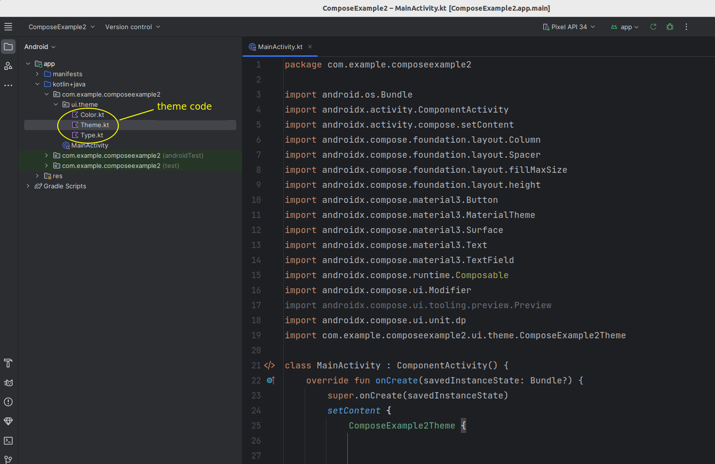
You can edit the theme files to set the theme for your app, in other words you can customise the different colour types (primary, secondary, tertiary, on-primary, etc) and typography. Color.kt contains colour definitions, Type.kt contains typography definitions and Theme.kt manages the theme as a whole. If you look inside the theme files, you can see that some definitions have already been setup for you.
Using a Theme
The Theme.kt file in the theme package provides a function you can use to apply your theme to your UI. This will be named <project name> plus the string Theme. For example if your project is called ComposeExample2, the theme function will be ComposeExample2Theme. Because this function takes a composable function (usually a lambda) as its argument, you can simply add composables inside it and apply it as follows:
All composables inside the theme will have the theme applied to them.
Setting theme colours and fonts
Material Design components will use default settings appropriate to that component. You can also, however. access the theme's colour and typography via the MaterialTheme class. This has a colorScheme property to access the colour roles, and a typography property to access the various font styles. For example:
MaterialTheme.colorScheme.primaryfor the primary colour;MaterialTheme.colorScheme.onSecondaryfor the on-secondary colour;MaterialTheme.colorScheme.surfacefor surfaces (composables designed to hold other composables - see below);MaterialTheme.typography.titleLargefor the Large Title font;MaterialTheme.typography.bodySmallfor the Small Body text font.
You can set the color of composables directly to material colours, while the typography values give you TextStyle objects. These store multiple aspects of the text style, such as font weight and size. To set the text style of a composable, use the style property, e.g:
Using the Material Theme Builder
It can be difficult to specify the precise colours and typography you want for your app manually in the theme code so that they all blend nicely. Instead, you can create your own custom theme using the graphical Material Theme Builder tool available online here. Using this tool you can pick your colour and font choices via a graphical interface, and generate Theme.kt and Color.kt files to use in your app.
Note that changes may have have to be made to the generated Theme.kt due to version incompatibilities, some of the parameters may not be compatible with the version of Compose running on your system. In general, any parameters showing as red syntax highlighting (i.e. error) can be removed. Also you may need to adjust the package name so it matches your project: the generated files are likely to have the statement:
You need to adjust them so that the package matches yours. You can find the correct package name by adding ui.theme to your project package name e.g. com.example.myapplication.ui.theme if your project package is com.example.myapplication. Your package name can be found at the top of your main activity source code file.
Finally if you use a custom font you need to add Google Fonts as a dependency.
Using a Surface
The most fundamental UI component of Material Design is the surface. The Surface is the UI composable which your Material Design theme is applied to, so you should wrap all your other components in a Surface. Surfaces can be styled, for example you can set the shape to specify the extent of curvature at the corners. You can have a surface on top of another surface, and each surface can be styled differently.
To use a Surface, simply wrap it round the other UI composables, e.g.
This example shows:
- a modifier (
Modifier.fillMaxSize()) which causes theSurfaceto occupy the whole of its parent, in other words theActivity. This modifier can also be used with other composables: not justSurface. - Also available are
Modifier.fillMaxWidth()to allow a composable to occupy the entire width of the parent, andModifier.fillMaxHeight()to occupy the entire height of the parent. - a
shapeparameter ofMaterialTheme.shapes.large, in other words it will have large rounded corners; - a shadow elevation of 1dp. This sets the elevation of the surface above screen level, which enables it to cast a shadow, producing a more "life like" experience (in real life, a piece of paper on a table would be slightly elevated from it and would thus cast a slight shadow).
More generally Surfaces can be used as a container for other composables when we wish to group them togther.
Further layouts - padding, alignment, arrangement
There are a few more Compose layout topics which we need to cover as we did not look at them in OODD, in particular the concepts of padding, alignment and arrangement.
Padding
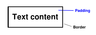
We briefly looked at padding in OODD. Padding is the space between an composable's contents and its border. So for example we can place padding around a Text composable which will give the appearance of separating it from neighbouring composables (though it should be emphasised that padding isn't space between composables - as we have seen, we use a Spacer for this - but the space between an composable's contents and its border).
The diagram below shows the use of padding.
Alignment
The alignment of an composable describes how it lines up against the edges of its parent composable. Normally composables are left-aligned, so line up against the left edge of their parent, however we can make them centre-aligned or right-aligned instead. This is shown below.
To align an composable, we use the composable's modifier and call its align() method. So for example:
Note how we use Start and End rather than Left and Right. This is to allow Compose to support right-to-left languages, such as Arabic.
Also note that centre-alignment is specified with Alignment.CenterHorizontally rather than just Alignment.Center. This is because we are specifically centering horizontally within a parent column.
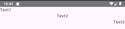
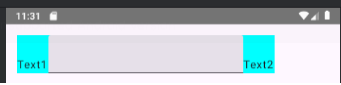
In this example there is a Row with two Text composables and a TextField. As the TextField occupies more vertical space than the Text, the Text composables will have their height set equal to the taller composable, the TextField. This means that the actual text ("Text1" or "Text2") will not occupy the whole of the vertical space of the Text composable. This means we can align the actual text vertically within the Text composable: Alignment.Top is the default, but Alignment.CenterVertically will centre the text vertically within the Text composable and Alignment.Bottom will align it to the bottom of the Text. This is shown below:
Aligning child composables relative to the parent's cross-axis
In addition we can align all child composables of a parent relative to the cross-axis of the parent (the main axis is the "long axis" of the parent, so horizontal for a row and vertical for a column, while the cross-axis is the other, as shown below).
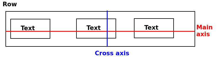
This is done using the verticalAlignment parameter for Row or horizontalAlignment parameter for Column. For example:
This will give the result below. Note how the Text elements are aligned to the Bottom of the cross-axis of the Row.
Arrangement
A related concept to alignment is arrangement. Unlike alignment which specifies how whole composables align to their parent, arrangement is a description of how the child composables of a parent arrange themselves within that parent, along the parent's main axis.
The Android documentation here discusses the different types of arrangement. You may recognise these from Flexbox which adopts a similar approach.
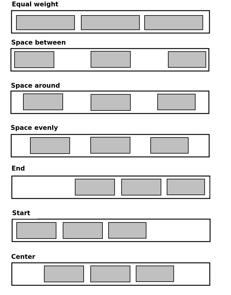
If the parent is a row, the following options are possible for arrangement (please see the link to the documentation above, which has a very nice animated diagram):
- Equal weight. Each child composable has equal weight (proportion of width of the parent) with no space between other than padding.
- Space between. If the width of the children is less than the width of the parent, space will be added between the child composables, with the leftmost composable resting against the left of the parent and the rightmost composable resting against the right of the parent (
Arrangement.SpaceBetween) - Space around. Similar to space between, but with space separating the leftmost and rightmost composables and the left and right of the parent, respectively (
Arrangement.SpaceAround) - Space evenly. Similar to space around, but with the spaces between the child composables having equal width (
Arrangement.SpaceEvenly) - End. All children are "pushed up" against the end (right in European languages, but left in right-to-left languages) of the parent (
Arrangement.End) - Start. All children are "pushed up" against the start (left in European languages, but right in right-to-left languages) of the parent (
Arrangement.Start) - Center. Children are centered within the parent but with no space between them (
Arrangement.Center)
These are shown below.
Similar modes apply in the vertical direction (parent is a column).
Setting arrangement
To set the arrangement for the children of a parent composable, use the horizontalArrangement property of the parent (for rows), passing in one of the above values, or the verticalArrangement property for columns.
Images
Another thing we have not covered yet is how to load in images. Many apps will show images, for example photos on a social media app.
To work with images we need to save the images within our res (resources) folder. We met this last week. Specifically, they need to be saved in the drawable subfolder of res.
In the composable in which we wish to display the images we load the image into a painter resource. For example if our image is named holiday_image_01.png:
The data type of painter is Painter and represents an image ready to be displayed in Compose. Note how we reference the image from the res folder using the R class which we met last week: specifically the holiday_image_01 property of the drawable property of R is a reference to the image resource holiday_image_01.png.
Once we have a Painter representing the image, we can then display the image using an Image composable. Image takes two compulsory arguments:
painter: thePainterobject as discussed above;contentDescription- a string description of the image, which is used for accessibility, to allow screen readers to inform the user what the image represents via audio.
For example:
Scaling images
In many cases the image may not exactly fit the dimensions of the screen; it may be smaller, it may be larger, or it may have a different aspect ratio. You can use the contentScale argument of Image to control how the image is scaled in these cases. There are various options you can specify to define how the image is displayed : please see here. For example, there are contentScale options to crop the image, or to stretch (and distort, which may not be desirable) the image so it fits the screen.
The above link also describes how you can display images within different types of shape (e.g. a circle) using the clip() method of the image's Modifier.
Box Layouts
Imagine you want to display a large composable, such as a list of items or an image, above a row containing text fields and a button, i.e something like this:
If you think about it, this isn't so easy. If you specify the modifier for the composable displaying the messages to be Modifier.fillMaxSize(), it will occupy the whole of the screen and there will be no room for the row allowing the user to send a new message. If you add the row first, it will appear on top of the screen.
What we need is another type of layout which allows us to specify exactly where each composable will be positioned, so we can position a composable at the top, the bottom, the left or the right. The Box composable allows us to do this.
Box layouts also allow you to overlay one composable with another.
In a Box, we can specify the alignment of the composables within the box. Here is an example:
This layout would look something like this:
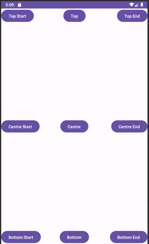
Note how we use the align() method of our Modifier for each button, to specify where it is aligned within the box. The possible values include:
TopStart- the top left of the box (but top right in left-to-right languages, such as Arabic);TopCenter- the centre of the top of the box;TopEnd- the top right of the box (but top left in left-to-right languages);CenterStart- the centre left of the box (but centre right in left-to-right languages);Center- the centre of the box;CenterEnd- the centreright of the box (but centre left in left-to-right languages);BottomStart- the bottom left of the box (but bottom right in left-to-right languages);BottomCenter- the centre of the bottom of the box;BottomEnd- the bottom right of the box (but bottom left in left-to-right languages).
Exercises
In addition to these notes, you may need to look at the Compose notes from OODD Week 7 and OODD Week 8 to complete these exercises.
Exercise 1
- Create a new project and copy the code of the feet to metres converter (nothing else) from last week into it. Apply your application's pre-generated theme to it. Add a border round the feet to metres converter composable, of
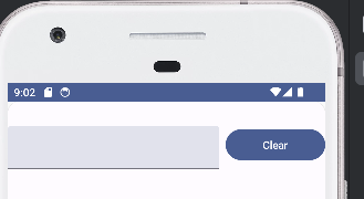
2.dpwidth and using your theme's primary colour. You will need to turn off dynamic theming - we will cover this in class. - Add a button to the feet-to-metres converter to clear the text field (set it to a blank string, "")
- Add a
Surface, covering the whole of the screen, and place your feet-to-metres converter composable within the surface. Set the background colour to your theme's surface colour. - A bit harder! Try making the
TextFieldoccupy the whole width of the device. I have not shown you how to do this, but you might be able to figure it out from the notes above. - Now try putting the
TextFieldandButton(to clear the value) on the same line. The button should have 8dp padding. Hint: use aRowto contain both composables. It should look something like this:
Hint: how would you align the items nicely within the row (so that they are centred vertically within the row)?
Ensure that the TextField and Button have a width proportion of 2:1, so that the text field has twice the width of the button. Hint: you can use Modifier.weight() to do this. Give the text field a weight of 2.0f (i.e. a Float) and the button a weight of 1.0f.
- Optionally, try creating a custom theme using the Material Theme Builder and export it into your app.
- Download this image and save it in your
drawablefolder withinres. Add code to load this image and display it within yourSurface. Ensure it has acontentDescriptionwhich uses an appropriate string fromstrings.xml. Use aBoxlayout to display your other content on top of the image. Place both in theCenterof theBoxlayout. Ensure the image covers the whole of the screen: as well as making sure you useModifier.fillMaxSize()with the image, you will need to read thecontentScaledocumentation linked to above, and choose an appropriate setting.
Exercise 2
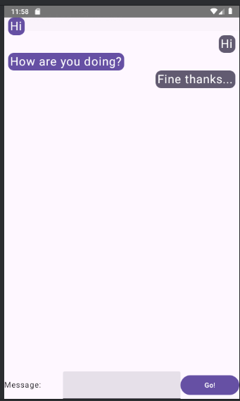
- Have a go at implementing a prototype of a simple messaging application using Jetpack Compose (lacking the communication-between-two-users aspect!). It should look something like this:
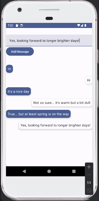
It should:
- contain a
TextFieldallowing the user to enter a message; - contain a button which adds the message to a list of messages;
- messages should alternate between being displayed on the left and the right of the screen, and alternate between being coloured with
MaterialTheme.colorScheme.surfaceandMaterialTheme.colorScheme.primary(use aSurface, see below).
Try and figure out how to lay this out realistically. Some hints:
- Use a
Rowto contain each message. Rowtakes, as a named parameter,horizontalArrangementwhich can be set toArrangement.End(items are added to the end of the row) orArrangement.Start(items are added to the start). Set it appropriately for each message.- The
Rowshould contain a separateSurfaceto contain the message. The idea of a separateSurfaceis that it can e styled separately to the mainSurface. Set its colour by setting thecolorargument directly, not through a modifier. This is because the fundamental colour of aSurfaceis its surface colour (while for aTextcomposable the fundamental colour would be the text colour). Also, give it ashadowElevationof 5dp. - To prevent messages occupying the whole width of the screen, give each
Surfacea padding. Messages on the left should have the end padding (padding on the right) set to 30dp, and messages on the right should have the start padding (padding on the left) set to 30dp. You can set individual paddings by passing named parameters toModifier.padding, e.g
- The
Surfaceshould contain aTextwith the appropriate message. What colour should the text be set to? - Can you also use padding on the
Text?
- Having done the above, try changing it so that the line containing the
TextFieldandButtonis at the bottom of the screen, below the area which displays the messages. You will need aBoxlayout for this.